The best
christmas movie logos
of all time

Greetings and salutations! And a VERY Happy Holiday from Drawn In Creative Services. Whether you’re enjoying the season or cursing it, one thing’s for sure; You’ve been exposed to some type of debate on the internet over what the best Christmas movie of all time is.. Or, just as likely, what constitutes a Christmas movie. We’ll let better minds who all agree that Die Hard is a Christmas movie hash all that out. One thing we haven’t seen debated is which of all of these cinematic masterpieces has the best logo.. And it’s one that we’re confident to weigh in on. So grab a cocoa and a cookie and let’s break down some of the best Christmas movie logos of all time!

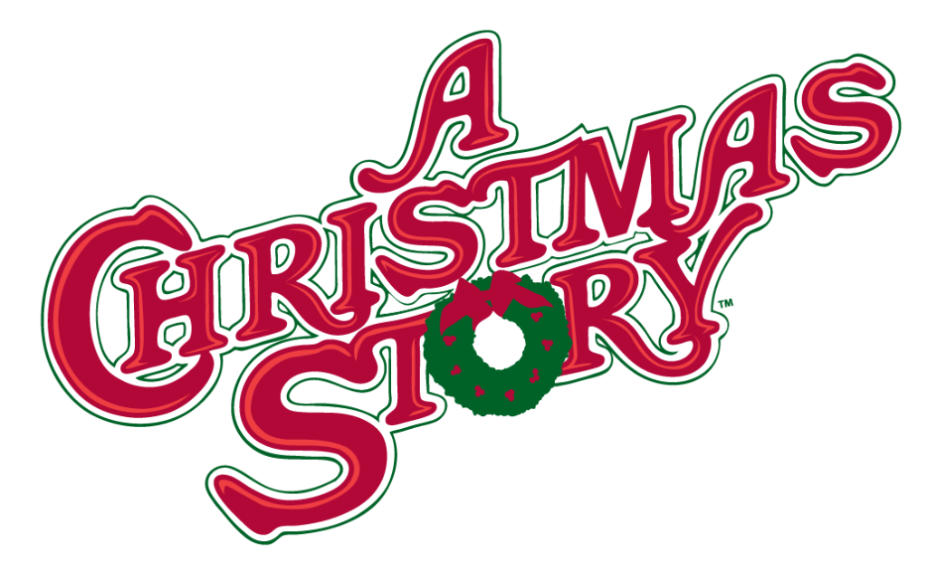
If you’ve never seen a Christmas Story, chances are you weren’t exposed to it as a child or don’t keep TBS on in your home for the entire month of December. No film has captured the nostalgic minds of anyone whose ever yearned for the perfect Christmas gift (Looking at you, Jingle all the Way) quite the way this movie has. The font is the perfect choice to bring you back through time to the Rockwellian holiday era. Its close-set and connected to evoke feelings of coziness but also organic to let viewers feel their own personal connection when they see it. The traditional red and green add to it’s nostalgia, finished off with a classic front door Christmas wreath hanging in the center. All of these elements work together to make you feel like you truly are “home for the holidays”.

In our opinion, no film is more tragically overlooked as a classic Christmas movie than the 1984 horror/comedy classic, Gremlins. A delightfully mischievous tale that revels in it’s own sense of satire, Gremlins is best enjoyed while eating after midnight while soaking wet.. or something. Although the movie’s logo is no more than a very distinct type face, it’s the perfect example of the identity you can build solely around a font. It’s hand written, inconsistent nature give the feeling of something that might have been scrawled by Dennis the Menace. Rounded, fluid corners that seep into each other give a distinctive, oozey, sci-fi look. These qualities work together to let you know you’re in for a fun monster tale that you won’t soon forget. Finishing off with a bright, candy apple red underscores the films exuberant Christmas setting.. or blood. That ones a bit more open to interpretation.

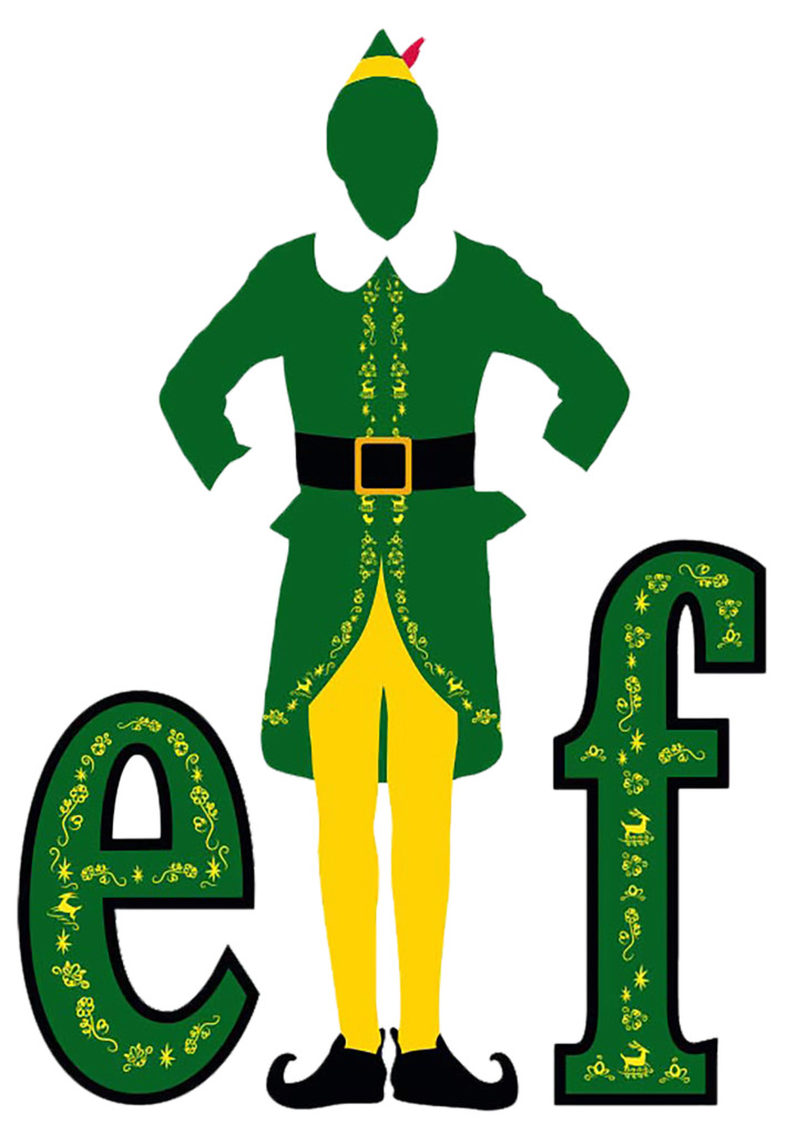
It’s tough to make a modern classic. Especially in the Christmas movie genre, which only gets a serious entry every 25 years or so. Elf was able to accomplish this by combining Will Ferrel’s grown man-boy character comedy style with a story that celebrates the true magic of Christmas. Now, Buddy the Elf is as synonymous with Christmas as Santa himself (bold statement?). Just as iconic is the akimbo green and yellow silhouette book-ended by a lowercase “e” and “f” that make up the movies logo. Even without the Christmas colored, traditional serif letters spelling out the title, there’s no question in the mind of the viewer as to who that silhouette belongs to. The Pose so undeniably represents the optimistic naivete of the character in his classic elf garb as to give it iconic status. It’s no wonder we view the world’s most recognizable logos in the same way.

With all this Christmas cheer going around, it only felt appropriate that someone would dedicate an entire movie to the demon elf that punishes children on the naughty list. Enter Krampus, a holiday horror tale about a family’s struggle to maintain the spirt of Christmas.. and the gory fallout that occurs when they don’t. The movies’ logo is another great example of how effective typography can really make or break a logo. The icicle laden, traditional holiday lettering reinforce the idea of something cold or isolating in the story to come. Adorning the “M” in the middle of the title with the creatures horns is just the right amount icing on the cake to foreshadow the movie’s antagonist.

When little Kevin McCallister is left behind from his families Christmas vacation to Paris, it’s up to him to fight off two burglars that break into the family home. After two hours of doggedly suspending your disbelief, we learn a thing or two about the importance of family around the holidays… and how to booby trap a home with micro machines. Close set, alarmingly yellow letters help to set the stage for a very chaotic family situation during the holidays. The bright red home with a very lonely light upstairs tells so much of the story to come that the viewer is curios from the beginning. Add on a lowercase, crooked e at the end of the vertical, Capitalized titles (the one that got left out), and the logo is a great example of how a narrative setup can play out in the titles alone.
That wraps it up for us this month. We love getting feedback from the community.. Are there any Holiday movies you think had a better logo? Anything you’d like to add to our justifications? Or, if you have an idea for another blog, be sure to reach out and let us know! Have a very safe, very HAPPY holiday and don’t forget to watch A Christmas Story 24 times on TBS.
