symmetry behavioral health
situation
Symmetry Behavioral Health, a provider specializing in workplace mental health and coaching, was in need of a brand identity, a website and marketing materials to promote their services.
task
I was tasked with developing a brand that spoke to their inclusivity, scope of services, and status as a trustworthy and empathetic source of mental health services. Additionally, business cards, brochures and a website that carried those same brand standards would need to be created to market their services.
action
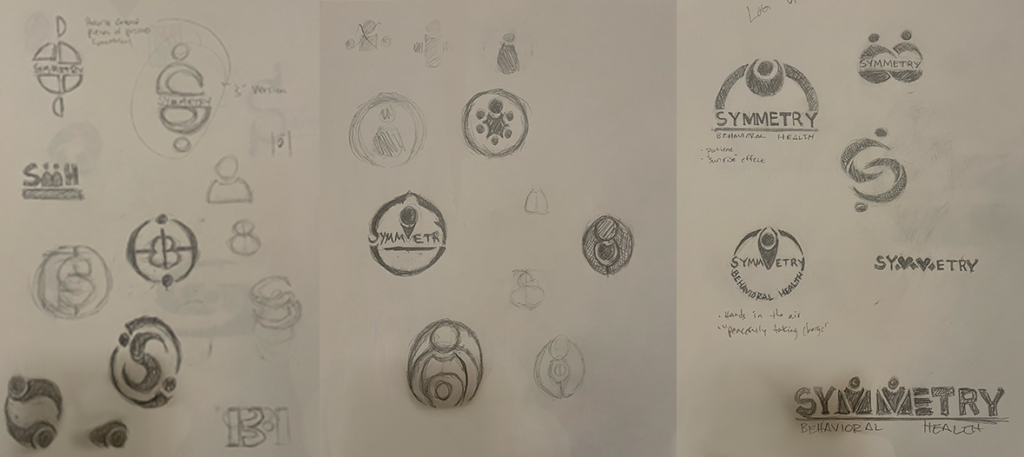
The first step in the process was to develop a logo. Through in depth discussion with the client, we decided that the logo should be patient centric, inspire a sense of trust and calm, and contain some form of symmetry, as to support the company name. Several rounds of sketches were employed in between meetings and iterated on until a final was chosen.

result
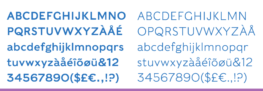
Determining typography for the Symmetry brand was the next challenge. We wanted to use a font that was reliable, modern, easy on the eyes and made the viewer feel comfortable. Having a sense of openness was also crucial, highlighting it’s importance in doctor/patient relationships. this same set of principles needed to extend to the color palette, which also had to convey a sense of trust and care.


Determining typography for the Symmetry brand was the next challenge. We wanted to use a font that was reliable, modern, easy on the eyes and made the viewer feel comfortable. Having a sense of openness was also crucial, highlighting it’s importance in doctor/patient relationships. this same set of principles needed to extend to the color palette, which also had to convey a sense of trust and care.
