patti labelle food group
situation
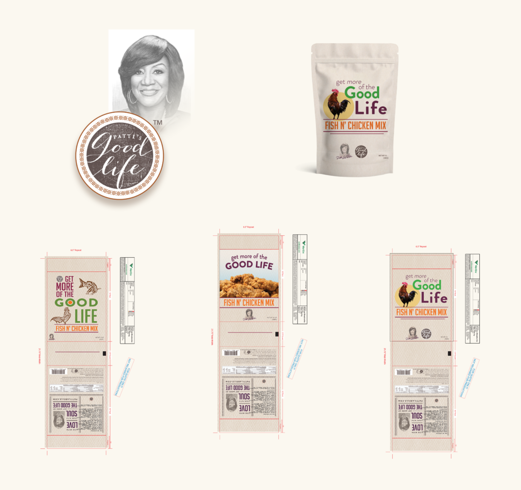
Patti’s Good Life, The Patti Labelle Food Group, was releasing a line of breading mixes for chicken and fish. The company would be in need of packaging design for their new product and reached out to me.
task
I was tasked with providing a small sampling of packaging design options to the client, rooted in their brand standards but given a fresh perspective that spoke to the product, their soul food roots, and customer base.
action
I wanted to include options that were different from a content perspective, individually, but in keeping with their brand standards. I began by drawing sketches and collecting different options for a mood board that I provided to the client. I reviewed the sketches with a stakeholder at their packaging company over the course of several weeks until final designs were selected.


result
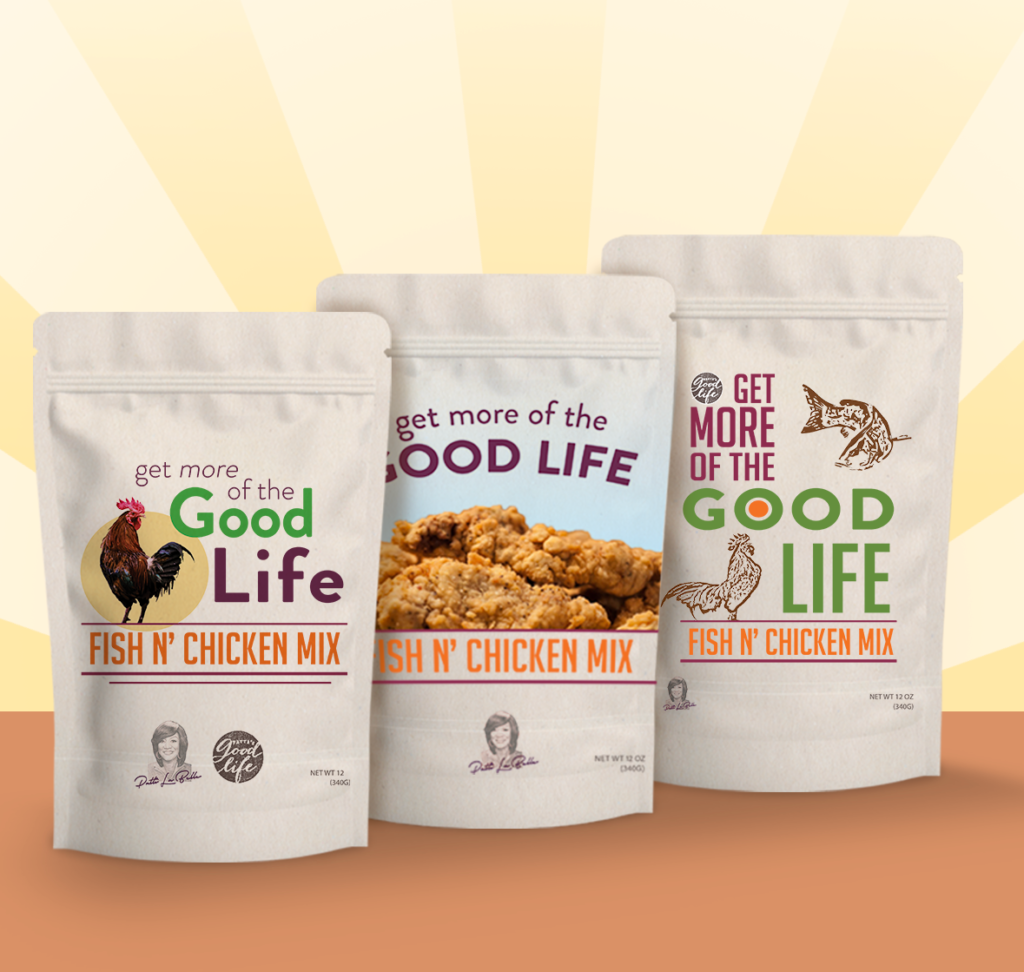
The collection displays the final designs chosen, the most prominent being the favorite. Using a mixture of iconography, photography, and typographic technique, I was able to provide several solutions that were distinct and unique in their own right but retained the same overall look and feel. The color palette was not clearly defined and I opted for a cohesive selection of tones that effectively spoke to excitement and a refreshing product while holding true to the quality they’re known for.
