celf regulate
situation
The health and wellness brand, Celf Regulate was in need of an identity. An identity that would be reflective of their mission to holistically empower folks with chronic health conditions to better co-exist with said condition.
task
In addition to brand strategy fundamentals, a visual identity would ultimately need to be crafted based on that discovery work. These visual components, logo, color palette, and imagery would need to be a calling card back to the brand strategy fundamentals of identifying Celf Regulate as a company.
action
The process began with discovery; identifying Celf Regulate’s mission, vision, values, and unique positioning statement. It’s important to have these things nailed down as they are instrumental in informing the overall look and feel of the creative. Once these things were fleshed out, it was on to the competitive analysis phase! We identified the clients key competition and evaluated their business model from both a creative and business perspective. This was helpful in identifying what made Celf Regulate unique in the marketplace and how to differentiate them from what their competition is doing.
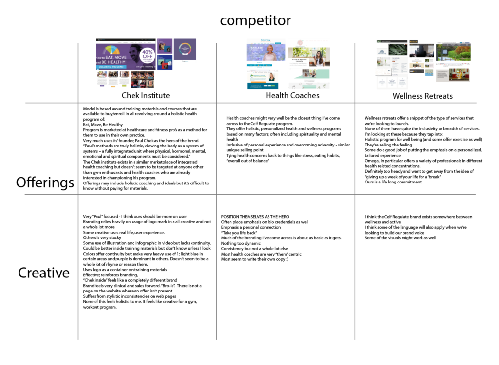
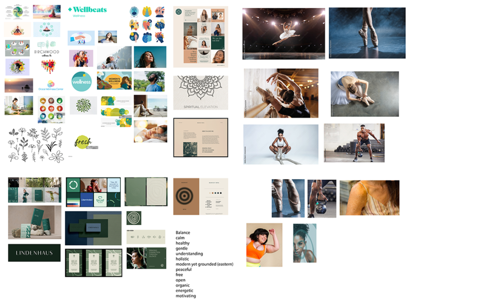
Putting a competitive analysis together was helpful, not only for messaging and positioning considerations, but for visual as well. From that competitive analysis, we were able to extract and identify things we thought worked, didn’t work and how it might be integrated into our own brand. And thus, a more expansive mood board was built!
result
From that mood board, we were able to further identify the look and feel we were going for in terms of color palette, logo, typography, and image selection for key art. The result is a brand that feels inviting, non-judgmental and active. Celf Regulate wants to be your guide in the journey between you and your chronic condition; Your pursuit of cellular equilibrium. This idea informed the logo mark; a simple yet resonate circle representing not only a blood cell, but the totality of incorporating these four pillars of health into your life; A lifelong commitment.
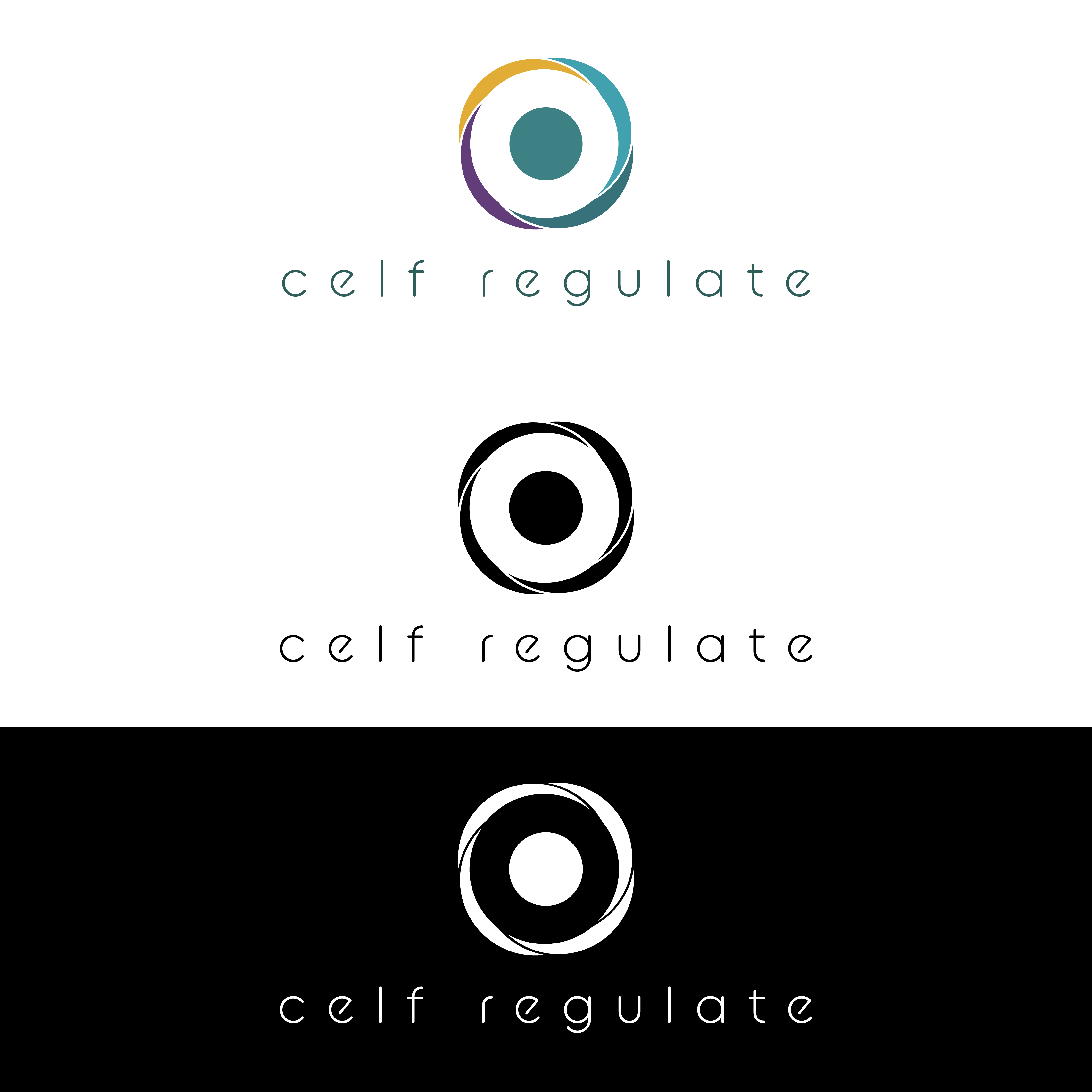

The color palette is built around a custom teal; a nurturing tone that is inviting, stress relieving and representative of new beginnings.
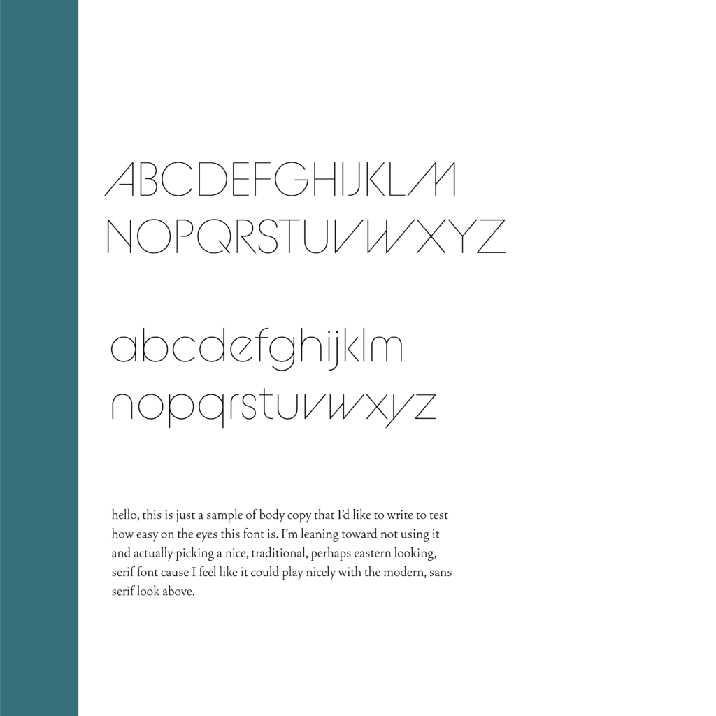
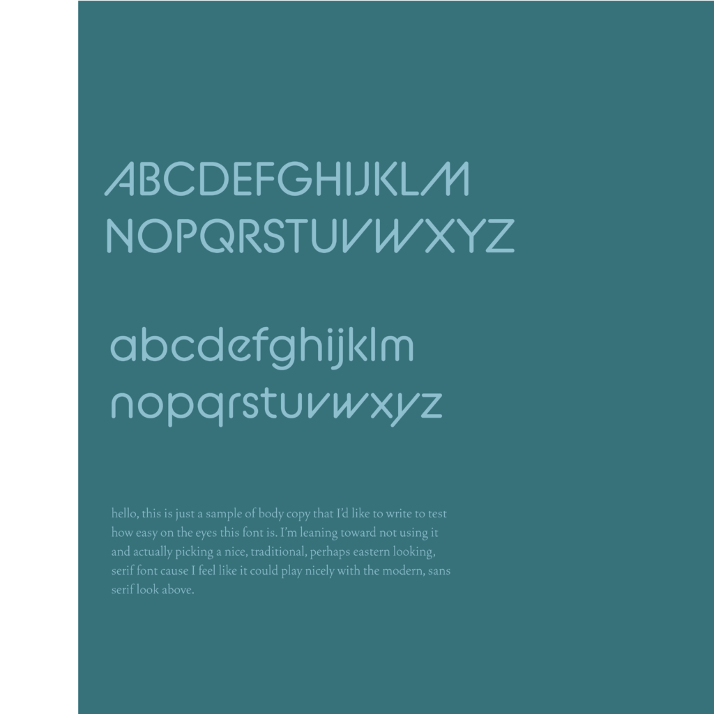
The font family we chose is BC Alpha Pipe, a modern sans serif, appropriately built around a circle in it’s geometry. It’s got an open feel and the use of slants on certain strokes add a nice level of movement to further underscore the active nature of the Celf Regulate program.

All of these elements come together for the key visuals to offer the user a window into what the program offers.. the feeling of “ahhhh”. Each image was carefully selected to capture the moment the client will experience when addressing any one of the four pillars of Celf Regulate with self love; Fuel, Motion, Psyche, Soul. The logo is used to frame that moment and add depth and movement to the artwork, solidifying it as “what ahhhh feels like”.
